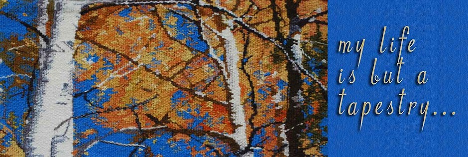
 Here is the completed "September" tapestry. It is 19x19 inches, so is not large. It is blocked, slits sewn, etc., but is not yet mounted, as nobody in town carries 19" stretchers, so my husband will have to make me some. For those who didn't see (or can't remember) the maquette, it came from 4 small oil paintings that I pieced together in the computer. Here it is again:
As you can see, it did not translate directly, but has some modifications. What I like about the comparison of the two is that the paintings feel very 'painter-ly' to me, while the tapestry does have a very 'weaver'ly' look to it. And by that, I mean that the paintings have marks that could only be made with paint, while the tapestry has marks that could only be made in the medium of tapestry. I like that kind of thing!


8 comments:
Those are beautiful - both the paintings and the tapestry!!
It is interesting how each medium affects what you create.
Beautiful!! Thanks for sharing it!
Sue
Congratulations!
:)))
Love it! I like it exactly as you said... the two are each essential what they are--a weaving, with woven marks and a painting, with color as only paint can render.
Great job, Kathy.
Tommye
Both are beautiful! I've never used either medium - but the more I see of your weaving, the more I'd like to try!!
Thursday 2/19/09 7:55am Thank you again for sharing this entire process.....the use of complementary color planning (or is that God's planning?) still impresses me....how could Eve have resisted from tasting this beautiful fruit? Can you tell I like realism? from Janet on the East Coast
It's wonderful to see the comparison of the two media side by side. Both are quite beautiful. Thanks for sharing!
Bravo! So beautiful an image in both media. I also like the asymmetry of the 1 apple...reminds me of the old Sesame Street segment..."one of these kids is doing his own thing" with the screen in quadrants. As ever, thanks for sharing.
This is a lovely illustration of how translation works. I don't know which impresses me (or cheers me) more--the idea-on-paper or the finished work. But it's inspiring no matter what. One of the qualities of good design should be that it can work in more than one medium.
Post a Comment